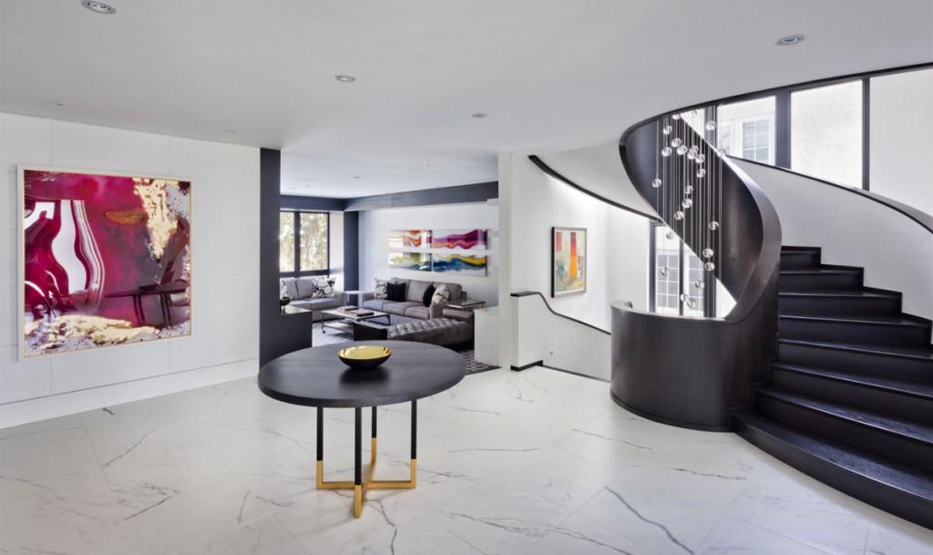
The foundation of “minimalism” comes down to one phrase: “Less is more”. Condensed in that one phrase is a broad philosophical landscape wherein art, design, music, and even a way of life has found a home. So it was only natural that when house design needed a new expression in the modern age, minimalism was there to welcome it with open arms.
The introduction of minimalism to house design can be traced back to British designer John Pawson when he released his book, Minimum, in 1996. With that, minimalism became the defining image of modern house design. Every designer and architect has a slightly different take on minimalism, of course. Even so, you can find common minimalist trends in many modern house designs nowadays:
Function as primary objective
Minimalism strives to simplify life to its essentials. In doing so, every object and feature must then serve a specific function in the design. Whether it’s for utilitarian purposes like the least number of chairs needed in the room or for aesthetic purposes like accentuating a piece of artwork, everything is there for a reason. Nothing is extraneous.
Open spaces are not emptiness
With the choice of each item so well thought-out, space starts to open up everywhere. But far from being mere pockets of emptiness, these open spaces are maintained for the most important function of all: giving you the room to breathe in complete content. And that is definitely not emptiness.
Simplicity of neutrality
You’ll often see a lot of minimalist spaces that primarily use neutral colours of black, white, and/or grey. Some people may look at that as boring or even cold. In the eyes of minimalism, however, it’s the ultimate representation of simplicity. There are no kaleidoscope of colours, no cacophony of overlapping hues, no veiled tones you’re supposed to pick up on. What you see is what you get. It’s a return to innocence where everything is black or white or both in the form of grey. It’s simply a world without complications.
Bursts of intentional colour
Minimalism doesn’t mean shunning all non-neutral colours though. It’s about choosing your colours carefully and using them with intent. And when your base colour palette is neutral, any burst of colour you add to the space will speak volumes. The intentional use of colour then becomes a powerful statement that stands out as opposed to lost in the chaos of competing colours.
Balance of textures
So, if colour is to be used sparingly, how do you distinguish between zones in a space? Textures. Mixing and matching textures will allow you to bring balance to a space of few colours. That can take form in different materials or patterns for the walls and floors. You can also make use of area rugs or even throw pillow covers. Just don’t go overboard by adding too many layers of complexity in textures though. Always design from the perspective of function as the primary objective.
Lines flowing into curves
With all the space that minimalism opens up, the straight lines of a room become all the more apparent. A design trick often used to soften the sharp angles is setting down furniture with smooth, organic curves. As our eyes travel from the lines to the curves, our pattern-seeking brains will work their magic to blend them together. This is what binds everything in one cohesive space where zones flow seamlessly into one another.
Floating shelves, hidden hardware, and streamlined lights
The seamless illusion is also supported by small details like floating shelves, hidden cabinet hardware (e.g. push latches or recessed handles), and streamlined or stripped down light fixtures. It’s hard not to gush over features that seem to just materialise out of the wall or ceiling.
Centred by art
Designing a house is always an art, but the careful scrutiny of each minimalist design feature feels especially like an art masterpiece. It’s no wonder that many minimalist spaces often highlight an artwork or photograph print centrepiece as the focal point.
Wall of the jungle
Greenery can play a part too in the sleek modernity of minimalist spaces. In fact, it’s a perfect embodiment of the minimalistic spirit; after all, what can be simpler than returning to the roots of nature?
Every feature is crucial in a minimalist space and requires a solid design to ensure function and aesthetics work as one. We can help bring simplicity back to your life.


